Money.co.uk top navigation
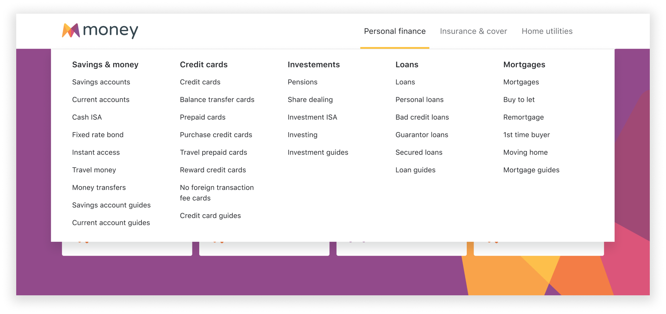
The navigation on the Money.co.uk site needed to be reworked. The SEO team needed to make changes to it and we saw an opportunity to improve its IA.
We gathered SEO requirements, researched where users were having problems and tested our solution.
Role
UX
UI
User testing
Time
8 weeks
Gathering SEO requirements
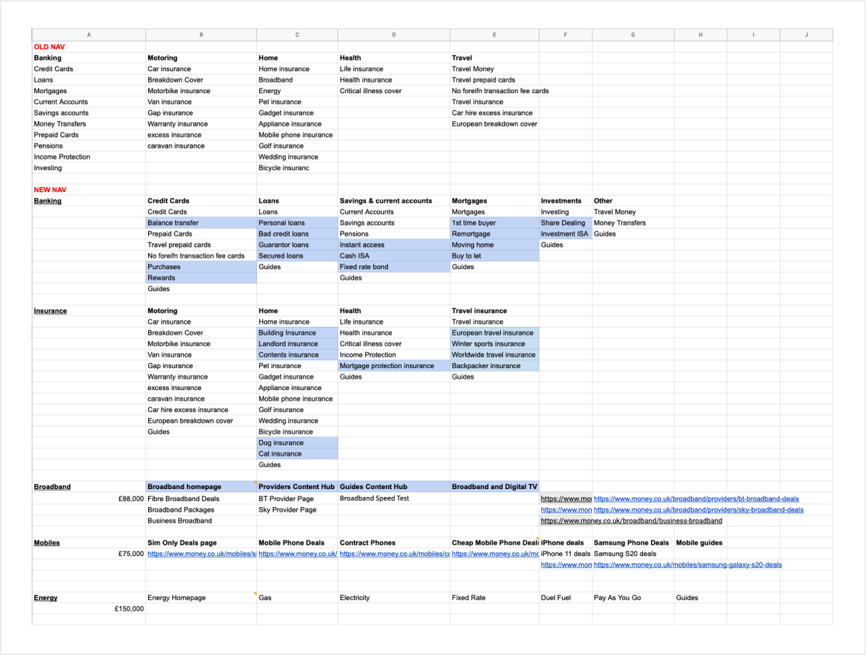
We worked closely with the SEO team who thought the main navigation could be improved to boost our SERP ranking. The SEO team supplied a list of links to be added and we went onto looking at our current navigations IA.
Identifying our users’ problems
We started by looking at how other sites organised their navigation.
We observed that other sites were able to fit in more links and help users find the page they were looking for.
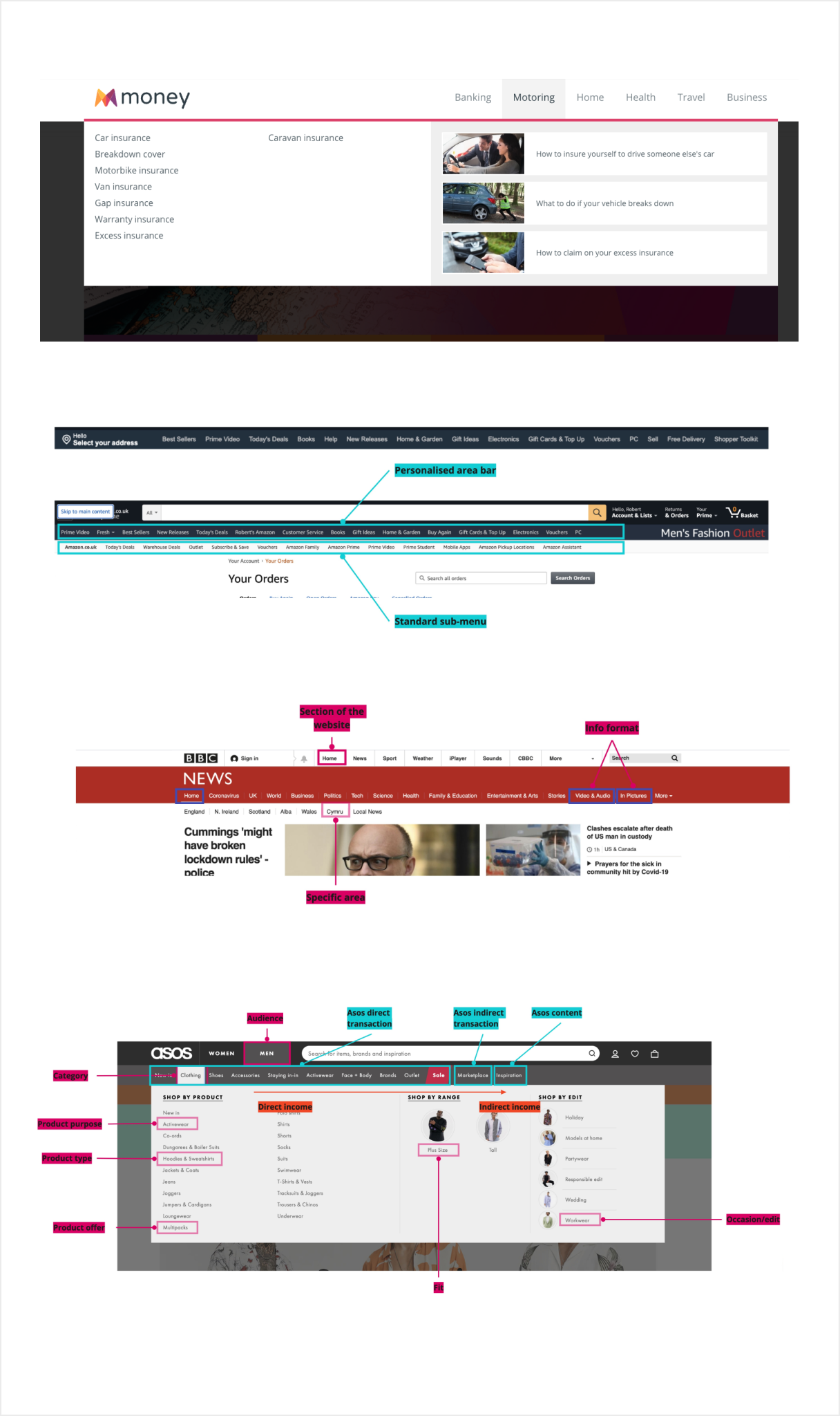
We also noticed that:
- There was no clear product division so finding a link could be time consuming
- Links may not be where users would expect them to be
To validate our assumptions, we ran an open card sorting exercise to see how participants would organise our links.
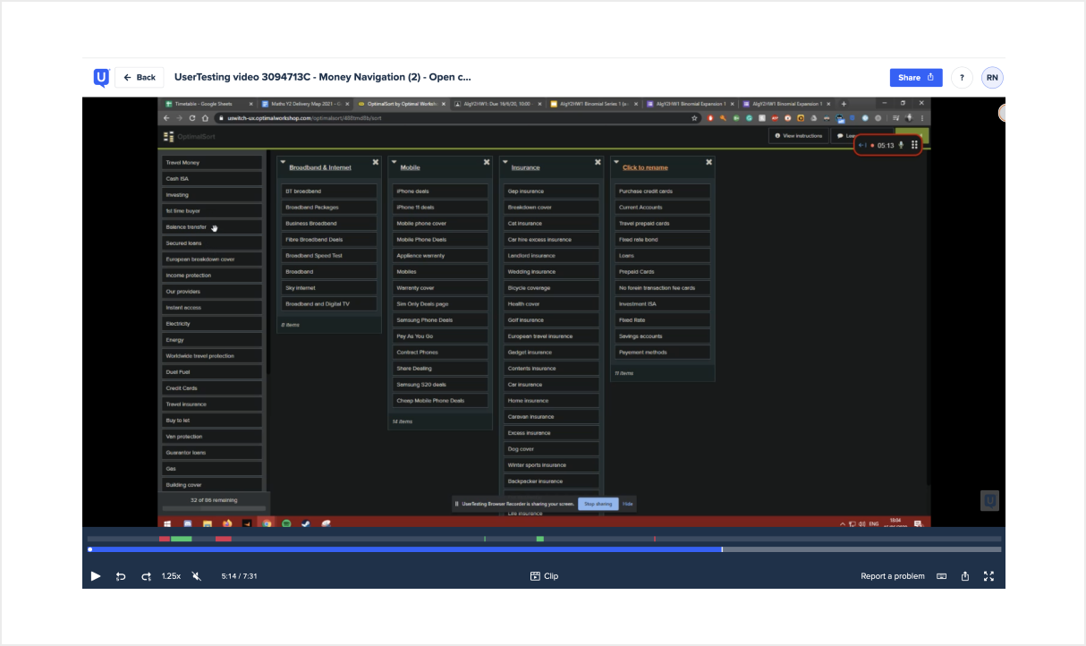
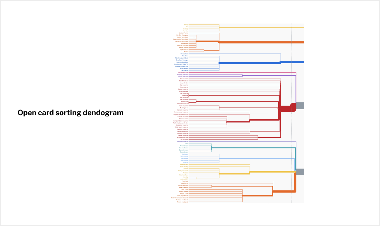
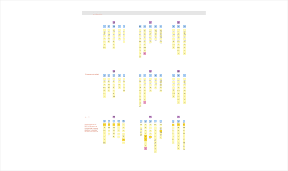
They created some similar categories to ours but new ones emerged. For example we had different types of insurance placed under differente categories, whereas participants grouped all types of insurances together.
Working on the IA
We wanted to reduce the number of categories initially available to users so they could access the relevant link more quickly.
We also wanted to match how people searched for products. We thought there were two ways of searching:
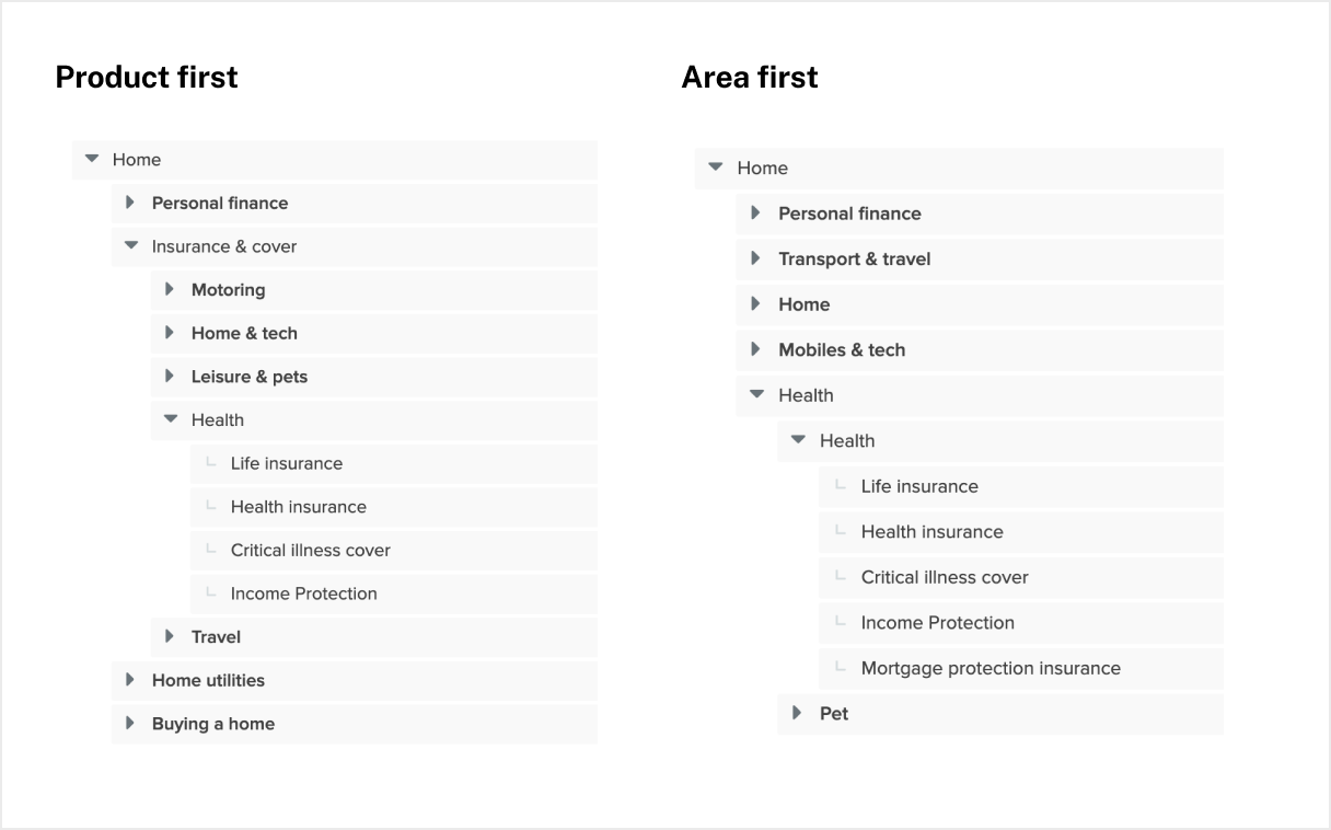
- Area first. This model meant that people would think about the area (eg. health) and then the product (eg. health insurance).
- Product first. This model meant that people would think about a product first (eg. insurance) and then the area they wanted (eg. health insurance).
Testing our solution
To understand which approach would work best, we tested them with a treejack test. We gave participants a series of scenarios and they were tasked with finding a product which would match the product they were looking for.
We looked at 3 factors:
- Time taken to find the link
- If they found the correct link
- How easily they found the link (did they find it directly or did they have to click back and go down a different route)
Overall the product approach was the most successful one.
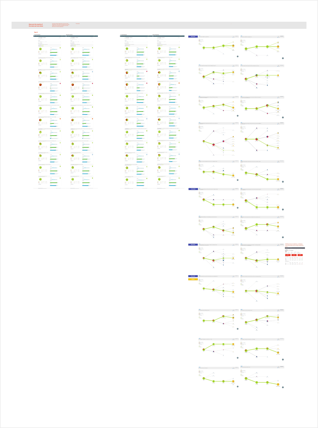
We then ran the same test multiple times to place links where user were expecting them.
Thoughts on the project
Overall it was a fun project to work on. It was my first chance to work on the IA of a site and to work with other teams. I particularly enjoyed testing out our new solution and it was great to see that participants managed to find the sections of the site more easily and quickly. If I did it again, I would work with an UI designer to create a navigation which reflects the Money’ branding more in terms of interaction and visuals.
It would have been good to do the scenario testing in our initial research to see more clearly the improvement of the new navigation.
We then ran the same test multiple times to place links where user were expecting them.
Thanks for having a look.