Updating the cookie banner based on regulatory changes
The Information Commissioner’s Office (ICO) changed the regulation on how users accept and reject cookies. The business wanted to implement a solution that would limit the impact on revenue but was not in our users' interest. My goal was to make this solution align with our users’ needs while limiting the financial impact and meeting legal compliance.
Note: Figures have been omitted due to their sensitive nature.
Role: UX, UI, User research, Content design
Activities
- Worked with stakeholders on testing approach and solutions
- Conducted and analysed user testing
- Worked on messaging with a content designer
Outcome
- Users had a cookie banner matching their preference
- Cookie acceptance rate stayed the same
- Increased interest from stakeholders in user testing
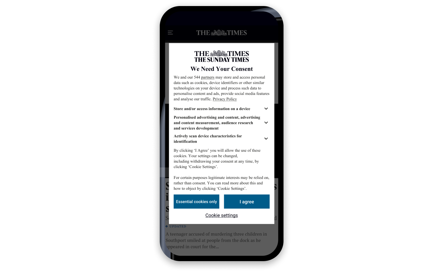
User problem
Research revealed that users faced multiple problems with the “Consent or Pay” model:
- It did not match their preference
- What was included wasn’t very clear
Business problem
There were multiple challenges facing the business:
- The proposed regulatory changes would lead to a loss in revenue
- A cookie “Consent or Pay” model had no precedent in the UK
- Risk of cancellation from long-time subscribers
Research and evaluation
The ICO’s proposal was to have a cookie banner where users could either accept or reject all cookies. Stakeholders (SLT, finance, legal) thought this would be too risky for revenue. Instead, they wanted to let users either accept all cookies or pay to reject advertising cookies.
I advised stakeholders that we come up with an initial mock-up of their solution and get feedback from prospective Times readers. This would allow us to:
- Benchmark comprehension and usability, since this was a new model in the UK
- Test quickly, as recruiting our user panel was slow and the ICO had set a launch date
- Iterate based on user feedback instead of gut feeling
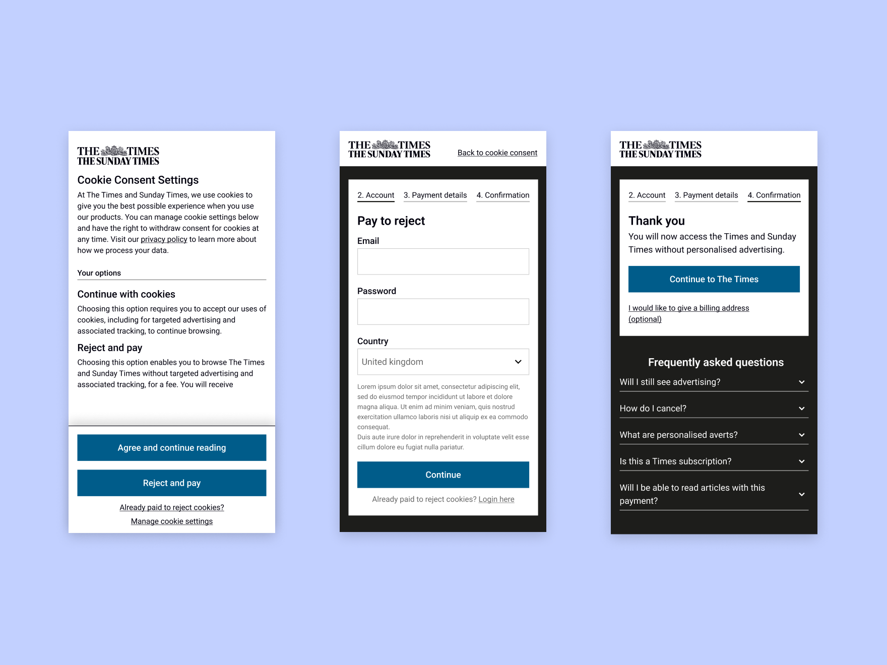
Testing revealed there were no usability issues—users were able to pay to reject cookies. However, participants didn’t understand:
- 27/27 users completed the journey
- 23/27 thought they would get something other than non-personalised adverts (e.g., a Times account, a Times subscription)
- 14/27 didn’t find the information clear (too much information, the wording was confusing)
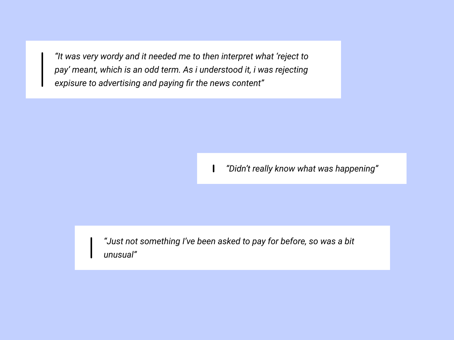
Main points
- Stakeholders accepted the proposed research and testing methodology
- Research revealed that the journey had no UX usability issues
- Research revealed the content wasn’t clear, leading to users not knowing what they were getting when paying to reject advertising cookies
Iterations and user testing
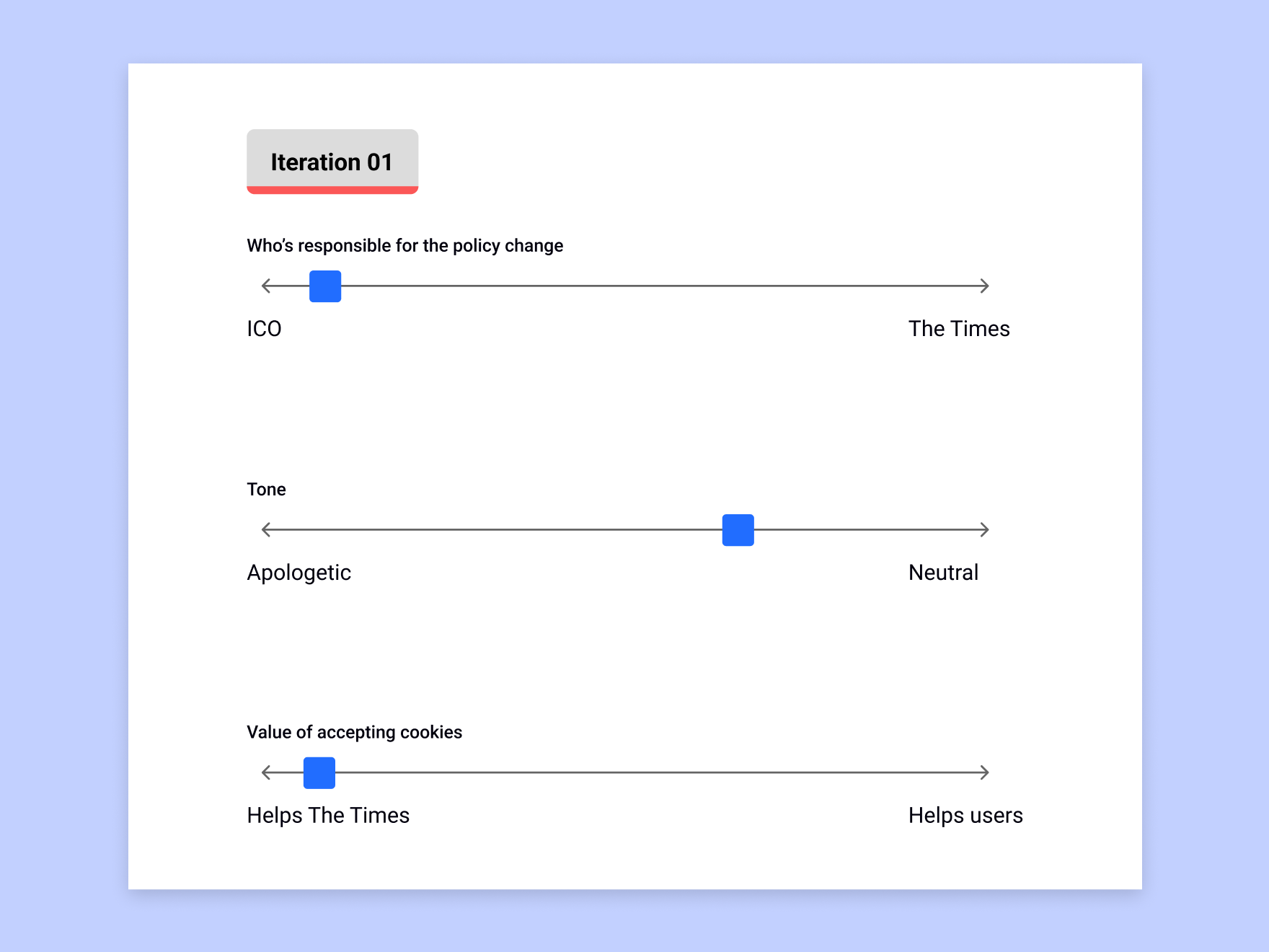
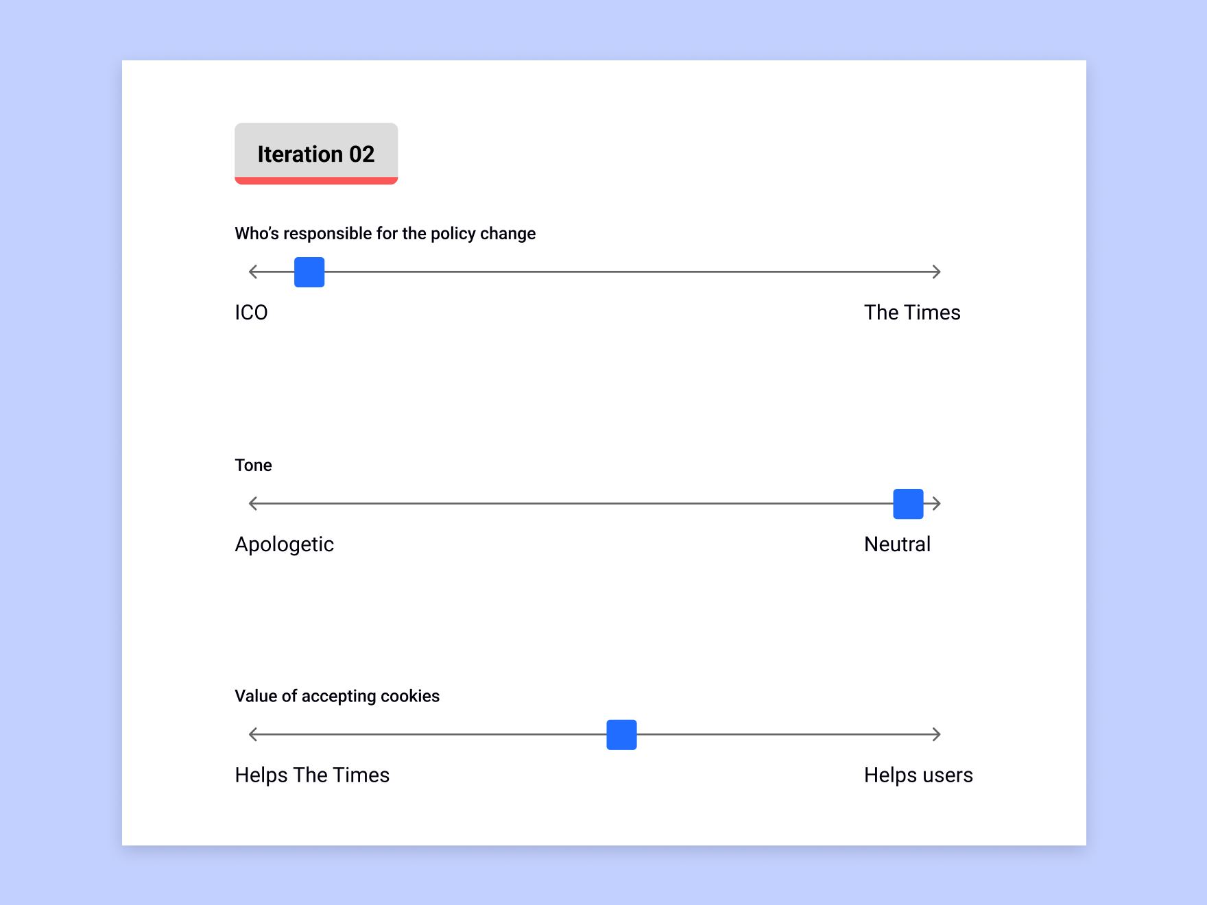
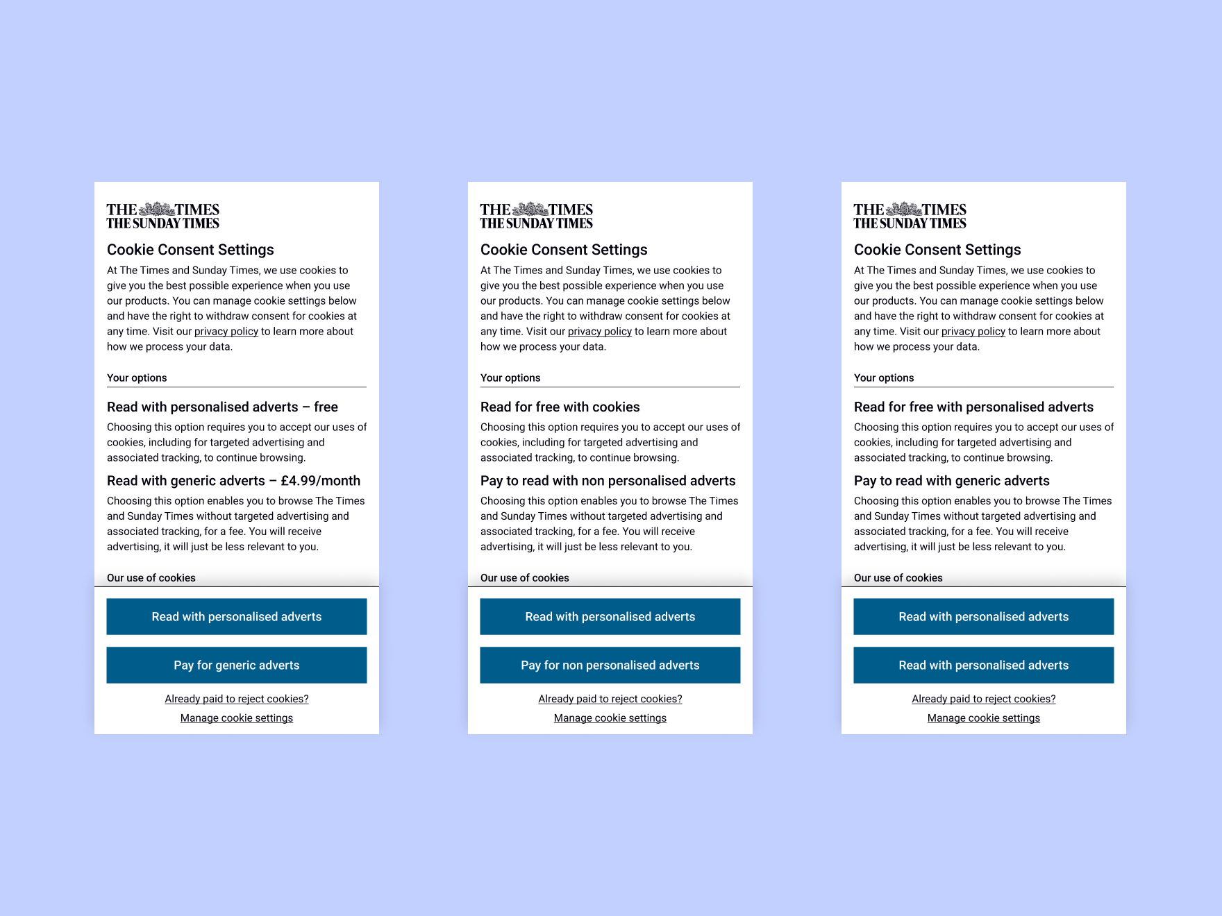
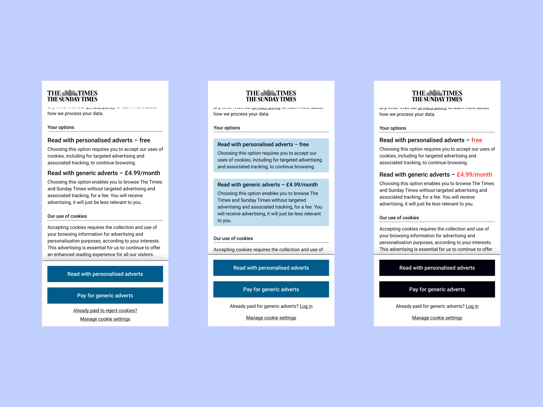
We hypothesised, based on the testing findings, that:
- By simplifying the content, users would better understand what is and isn’t included with this fee
- By changing the UI, we could help draw users' attention to key information to aid their understanding
By iterating with these hypotheses, we improved users' understanding of what was included with the fee from xx% to xx%.
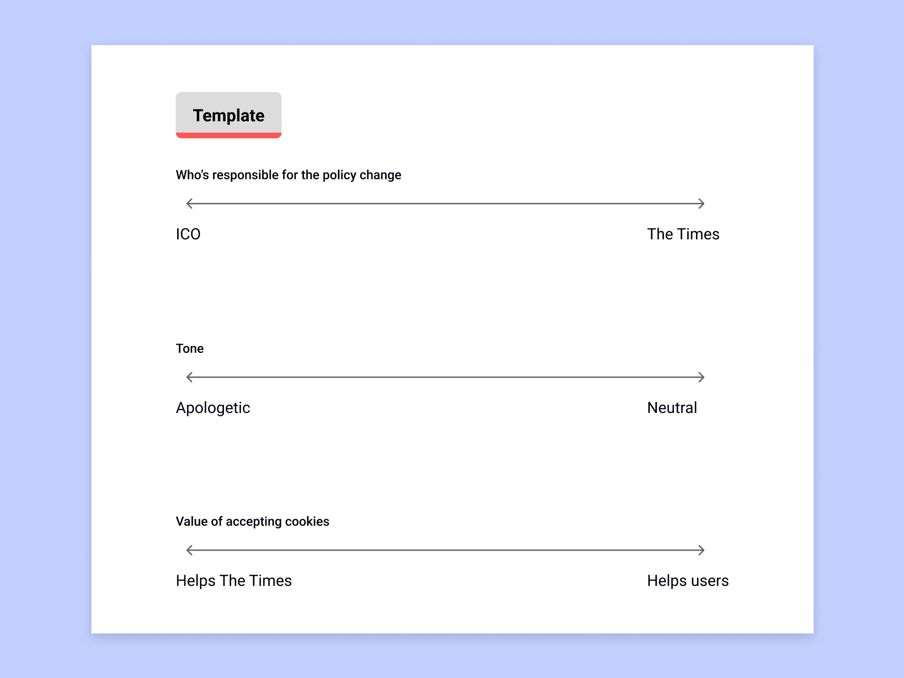
After feeling confident our messaging was clear, we tested with our subscribers to gauge their reaction to this change. This led to the discovery that:
- They did not like having to pay extra for privacy
- A significant proportion mentioned canceling their subscription if this was implemented
- They thought the aim was to create a new revenue stream
We further iterated on the content with the hypothesis that fewer users would mention canceling if we better explained why this fee was being introduced.
This resulted in:
- Users still being frustrated but more understanding
- ~6%pp decrease in mentions of cancellation, reducing the risk for the business
Main points
- Iterated on content and UI separately
- Improved users' comprehension of what was included with this secondary subscription from xx% to xx%
- Testing revealed there was a cancellation risk associated with the cookie banner the business wanted to push live
- Reduced mention of cancellation by ~6%pp in testing
Testing it live
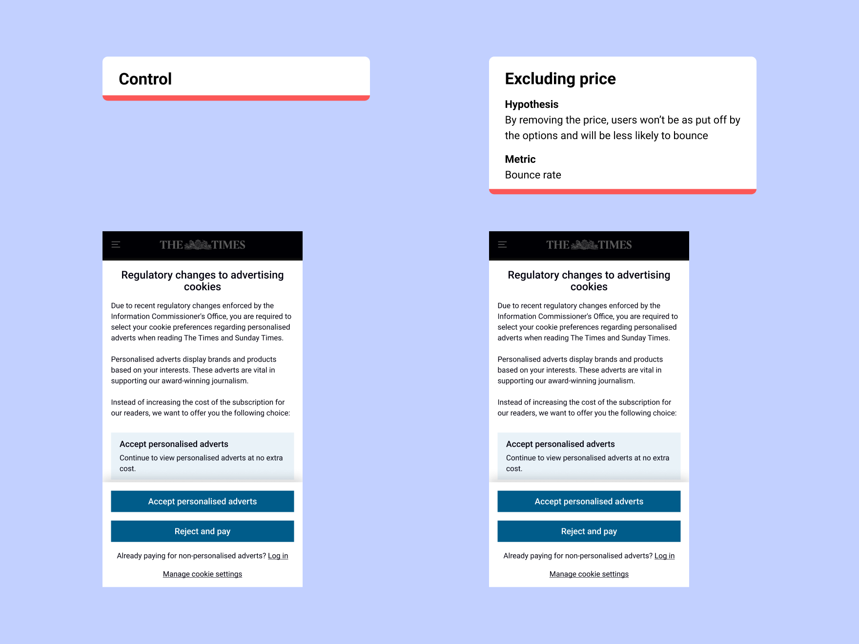
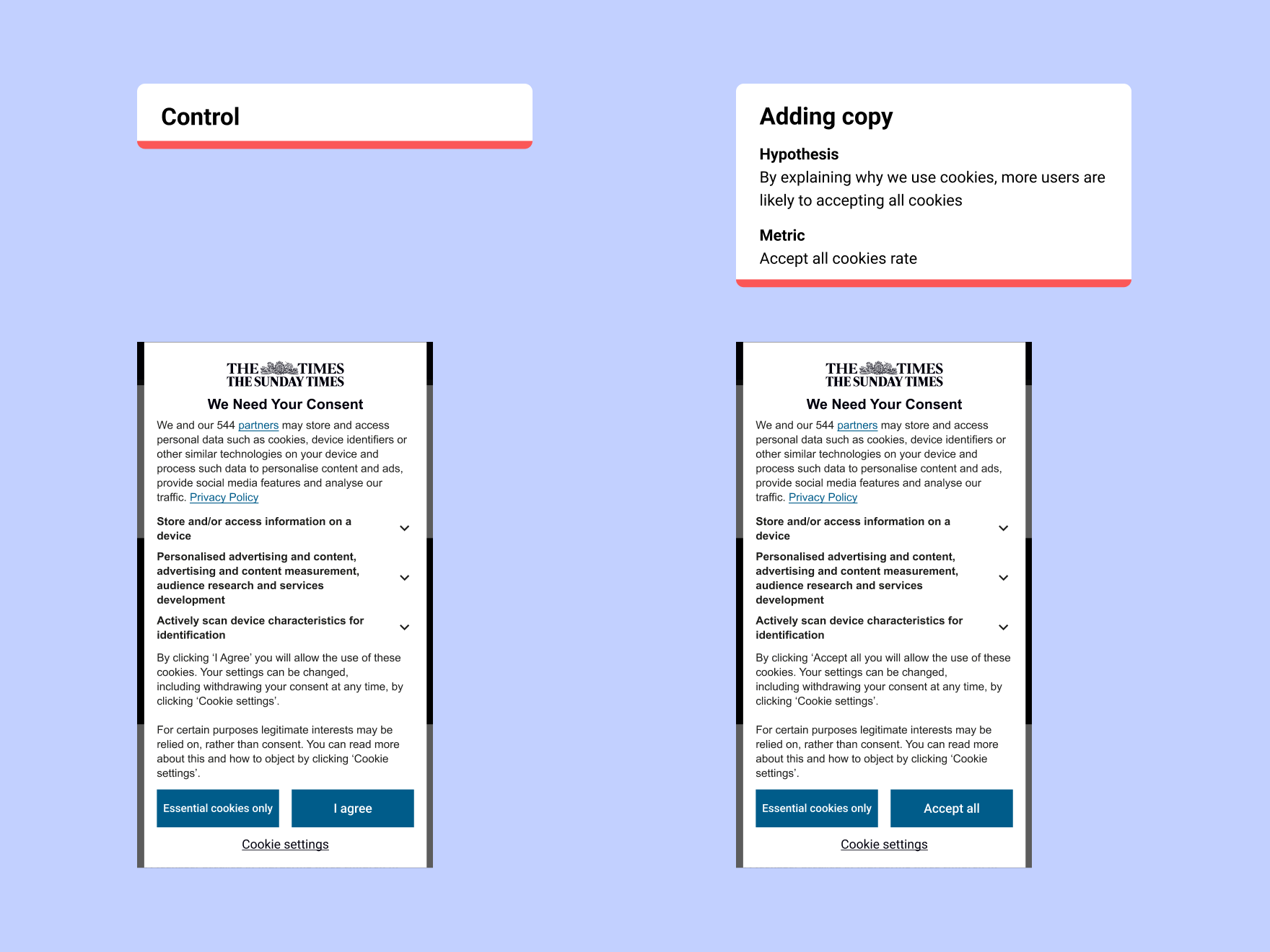
With the risk of losing subscribers, I proposed launching both new cookie banners as an A/B test. This would allow us to gauge the cancellation and acceptance rate on both banners.
Once live, we saw the same acceptance rate for both banners, with more users bouncing on the “Consent or Pay” variation.
The finance department modelled the impact on revenue and told us that the ICO’s cookie banner (accept or reject all cookies) was the best option.
Once live, I handed the project over to the cookie and compliance team with recommendations on what they could test to increase the cookie acceptance rate.
Main points
- Proposed and launched an A/B test with new cookie banners to gauge cancellation risk and cookie acceptance rate
- Business proposition was not rolled out based on the test results
- Users and the business got a banner that worked best for them
- Handed the banner over to the responsible team with testing recommendations
Testing it live
Design team visibility increased
This was a hard project to work on. Advocating for users was met with a lot of resistance but became easier when stakeholders saw how user insights could help them model potential revenue impact. The upside is that the design team (which was new to the business) now has more visibility, and user research has more buy-in.
Launching new banners sooner
I would have liked to have launched the new banners sooner. We did many rounds of tweaking the copy and saw little improvement. We weren’t allowed to launch until we tested every idea thought of, which I understand since they were worried about the impact on revenue, but being bolder and launching sooner would have saved a lot of time.
Slow to gain allies
It was a challenging project. SLT already had an idea in mind that they did not want to veer from, based on an assumption they didn’t want to test properly. Thanks to sharing user insights, I slowly gathered more allies within the group. This was a slow and challenging process, but it led us to being able to challenge the proposed solution in favour of a solution that matched users' needs.
Business over user
I didn’t enjoy designing a product that was bad for our users. It was something that had to be done, though, since if their model impact was correct, it would have had repercussions on other projects. I’m happy that I was able to make the proposal clear to users—this meant they weren’t misled and were able to make an informed decision.
Thanks for having a look.