Uswitch Quick Checker
When the energy crisis hit, energy suppliers pulled their fixed deals from the market. For the first time in 20 years, Uswitch wasn’t able to switch energy plans. Our users felt very unsettled because of the change, so we created this product to help them through it.
Role
UX
UI
User research
Time
8 weeks
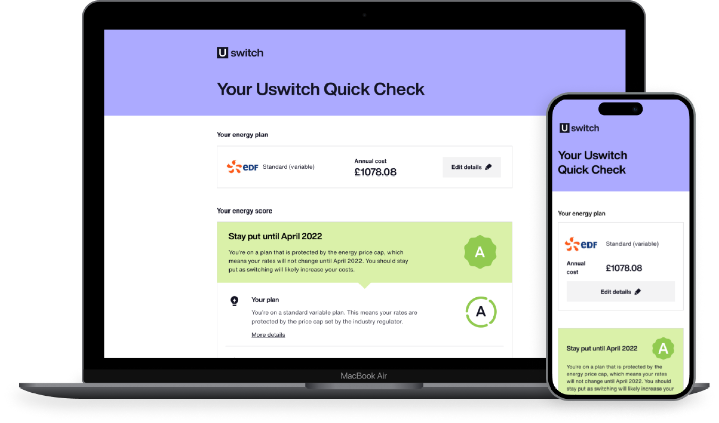
Our users needs had changed
Since we couldn’t switch people’s energy plan, we ran a series of interviews to learn more about them and tasked them with switching their energy. They went through the live experience so we could understand if it was still fit for purpose.
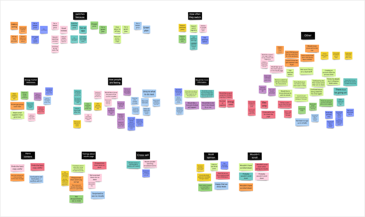
Our main findings were:
- participants were waiting to see what happens before making a decision
they were surprised to see no plans available, but this also confirmed their view that - they should take a wait and see approach
- once they found out what the situation was, they had different ideas as to what they should do next
Participants wanted to better understand how concerned they should be. This would help them feel more confident in making a decision about what they should do next with their energy.
Exploring how we could help our users
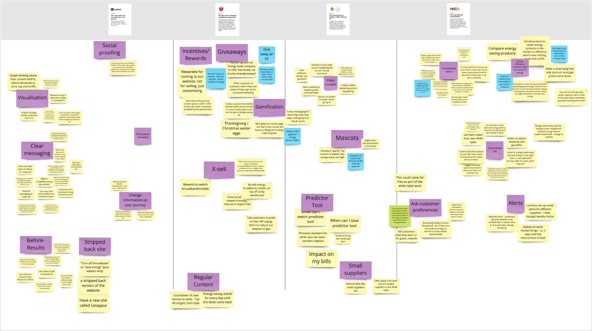
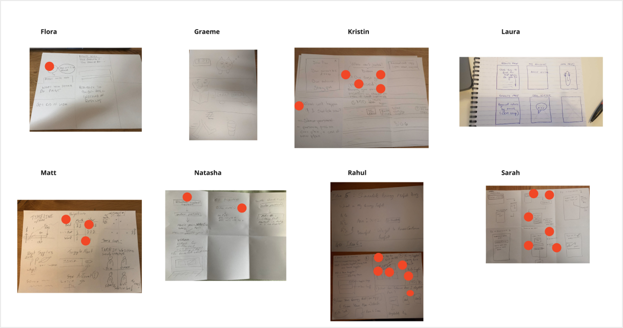
Now that we knew our product wasn’t meeting our users needs, we ran an ideation session with the team to start finding out how we could help our users. By the end we ended up with a number of ideas to go through.
Refining options
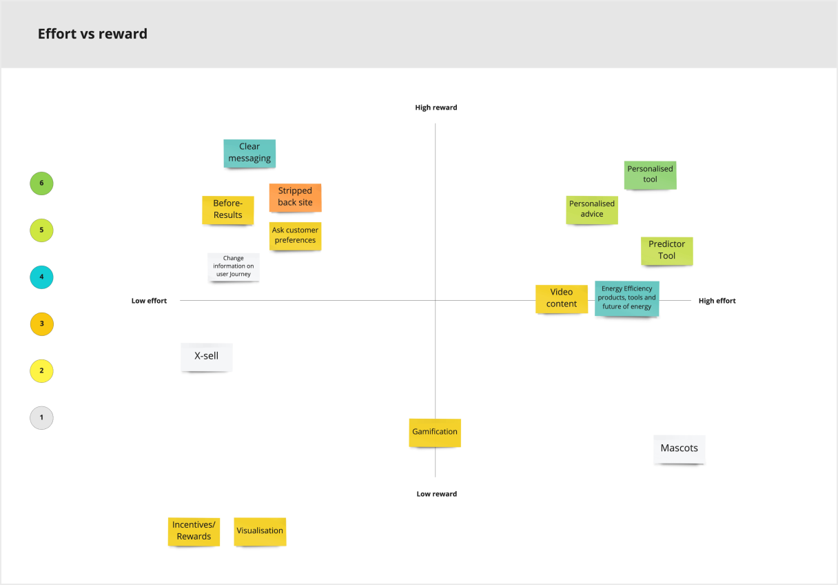
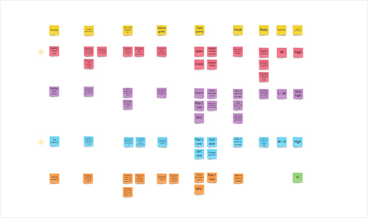
The lead designer and I grouped the ideas into themes and then looked at what data we would need to make them possible and what business value each one could bring. We also looked at what data we already had. This helped us gauge how feasible each idea was.
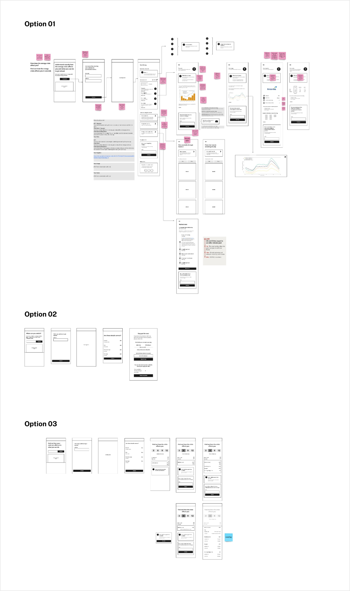
We narrowed them down to 3 options. We quickly mocked up what they could look like so that the team could better understand what each suggestion was. We then put them to team, where the majority of votes went to the Quick Checker.
The Quick Checker is a tool with the main aim of providing guidance to users. This would help them understand what to do in the new energy market. Another feature is the ability to sign up to guidance updates, also helping Uswitch grow the number of people they could contact (win-win).
Testing our direction
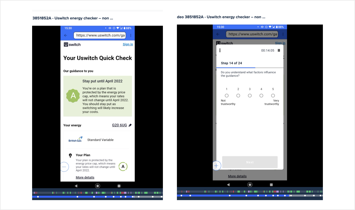
We wanted to make sure it met users needs before investing more time into it so I mocked up a prototype to test it.
The feedback we got from participants was that that they liked getting guidance on what to do from a company who is an expert in the energy market.
Refining our idea
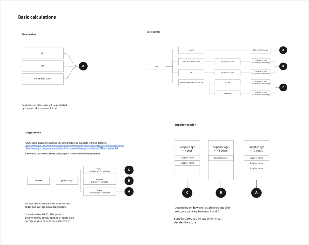
Now that we knew it was helping users, we spent time refining how it would work. We looked at how the guidance would work, how our users would interact with the page, what other bits of information we should provide. Once we had all of it thought through, we brought it down to something as basic as possible so we could launch it as a MVP.
We decided to make the guidance static in our first iteration, so everyone saw the same guidance (and since the market was still changing day by day telling people to stay put worked for everyone).
We also decided to only briefly explain how grades were determined instead of providing more information on each section.
As we were making these decisions, the engineering team started building the Quick Checker.
User feedback post launch
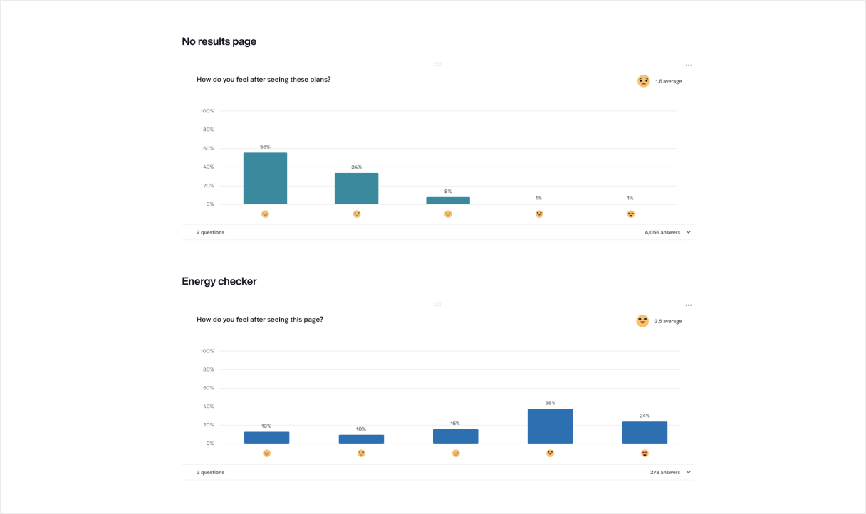
Once it was live we A\B tested to make sure it was meeting user needs. We launched it to 50% and had a survey up on the Quickck Checker and the control experience asking users how they felt after using this page.
The feedaback was that users felt better on the Quick Checker so we decided to roll it out to 100%.
Thoughts on the project
When we first looked at the guidance I would have pushed for more time to think about how the guidance would work long term. It’s now been live for a year and every time there is an announcement impacting the energy market, the team has to think about how it impacts the guidance and cater it for every type of user, which is very time consuming.
It was great working on a product from the very beginning although it was a challenge to be to launch it in 8 weeks.
It was also great to work on a project where we started by looking at user needs and finding a way for it to match with business goals.
It would have been good to interview people more often to make sure our product was always relevant and to be able to push back on demands from the business which made the Quick Checker more confusing.
I would like to have spent more time testing users understanding of the grades. In our testing users didn’t always understand what the scale was so they were unsure on how well they were doing if they got B for example.